Art is Basic has moved!

Art is Basic has moved!
Visit my new blog location by clicking on the Art is Basic logo.
Showing posts with label color theory. Show all posts

Tuesday, October 2, 2012

3rd Grade Color Mixing and Self Portraits


These 3rd grade self-portraits were charming and delightful.  We spent two class periods mixing colors for the background.  Each student experimented with combining colors to see what would happen.  Then, we used construction paper to make the faces and markers to add details.  I guided them step-by-step with tips for drawing and placing the features.  The students used mirrors when drawing their features. 


Tuesday, April 17, 2012

Monochromatic Rhythm Paintings-- 3rd Grade


I love these monochromatic rhythm paintings!  The lighting was weird when I took the pictures, so I'm not sure the colors are as vibrant as they really are.  We talked about rhythm in art and how to create it by repetition.  The students learned how to mix shades and tints of one color.  Gold was added at the end for a final touch (so in the end, I allowed them to "cheat" on the monochromatic part, but the gold adds such a fun element.. what do you think?  Can it still be officially a monochromatic painting?).  I also love teaching the etymology of words like this.  I see if they can guess what the word means by breaking it up into parts.  Usually with the collective knowledge of the class, they can figure it out. 


Thursday, December 22, 2011

Cool Hands, Warm Heart-- Kindergarten

These charming pictures of hands were a lesson on warm and cool colors.  The hands are colored in cool colors and the heart is colored in warm colors.


Wednesday, November 9, 2011

1st Grade Complementary Color Collage


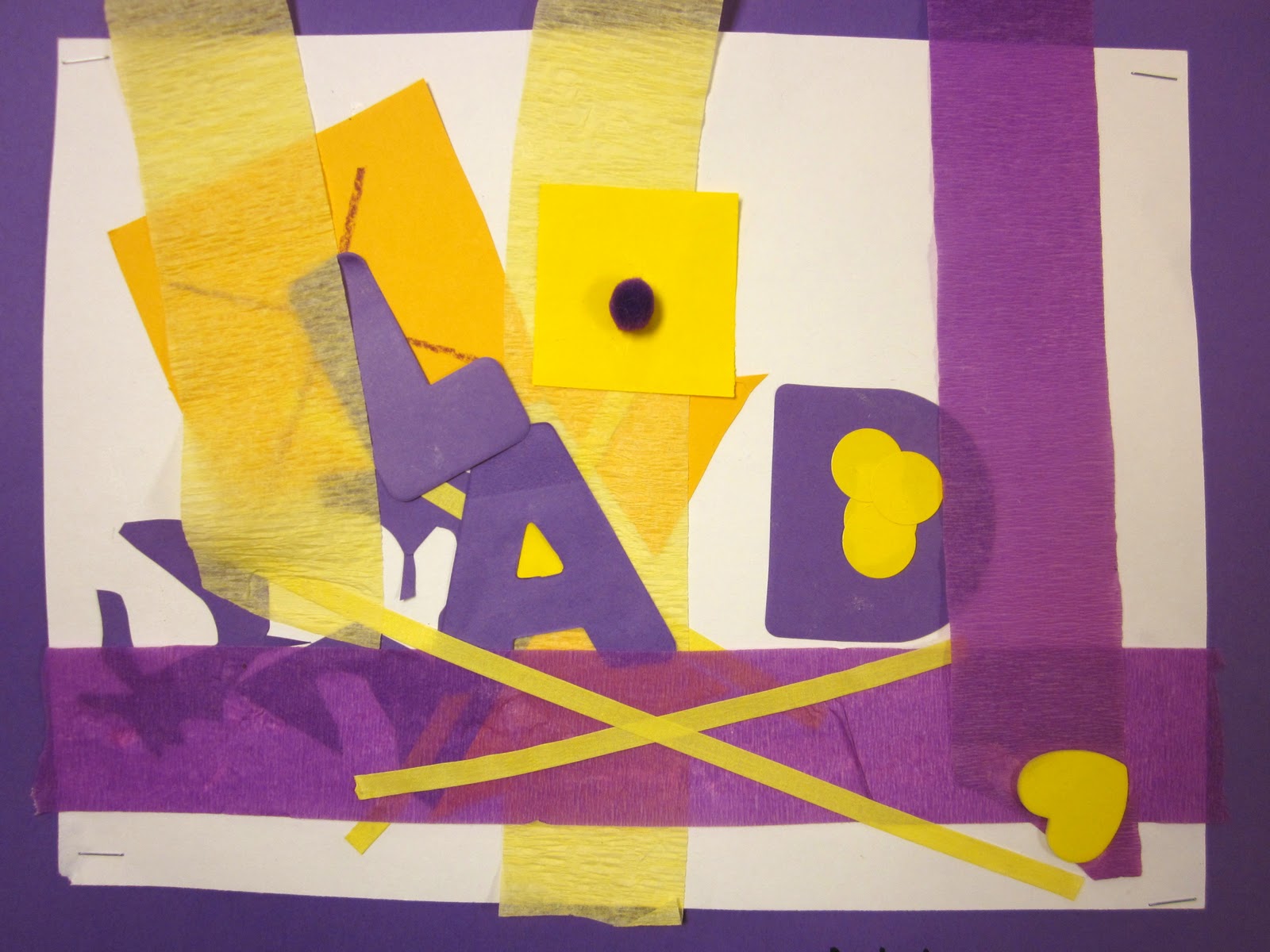
Here is an easy project for first graders to introduce complementary colors.  We started off by coloring a mini-color wheel (did not include the tertiary colors).  Then, we identified the complementary colors on the color wheel.  Next, the children were called up to pick out two sheets of paper that were complementary colors.  I monitored to make sure that these were indeed complementary colors.  Next, the children cut out different types of shapes from the papers and glued them to their paper.  The following class period, I had a little "kit" made up for each of them with things that had "their" colors.  I took a large ziploc bag and placed in the kit things such as colored cellophane, tape, stickers, pom pom balls, foam shapes, crepe paper streamers and so forth. 


Wednesday, October 26, 2011

Piet Mondrian-- Kindergarten

What are the Primary Colors?  Who was Piet Mondrian?
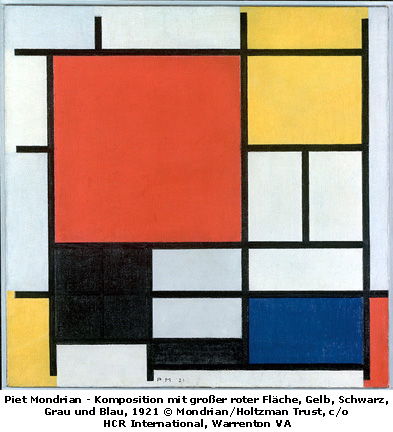
The Nest will be looking at artwork by the artist named Piet Mondrian.  Some of his artwork was characterized by use of a very simple color scheme (usually the primary colors and black and white). His art had strong, straight lines and repeated use of squares and rectangles.  The students will be able to name the primary colors and recognize Mondrian's artwork.  They created their own artwork using the primary colors and black construction paper.


We also read the book The Color Tree, which is a colorful story about the primary colors.  The Color Tree

Thursday, June 30, 2011

Tape and Sticker Pictures

box of stickers
This was a super fun art project that I forgot to blog about earlier.  We did this at the summer art class I taught at my school.  Tape and sticker pictures.  I wrote about tape and sticker pictures earlier which I love to do with my 20 month old daughter.  The above picture is a box of stickers I made.  I took some sticky address labels, and color photocopied some patterned paper onto the sticky labels.  Then, I cut them into strips, so the stickers would be little squares and rectangles.  The kids used these stickers plus all types of colored tape to make pictures!  There is a wide range of colored tapes you can buy from art catalogs.  Thin, thick, medium sized, neon colored.. etc. I also had some alphabet rubber stamps that some of the kids chose to use on their pictures.  I didn't give the kids any restrictions, because I wanted this to be an exploration of their creativity... of what they could do with a line...how they could arrange stickers and colors to make a cohesive picture...  These were done by kids in grades K-4.


Monday, April 11, 2011

Monochromatic Rhythm Paintings


Monochromatic Rhythm Painting  The third graders are learning about how rhythm is used in art.  Rhythm is a principle of art that's difficult to summarize in words. Assuming that you've picked up on a rhythm in music before, take what you heard with your ears and try to translate that to something you'd see with your eyes. Rhythm, in art, is a visual beat.  They made a drawing using lines to show rhythm.  Then, they mixed tints and shades of ONE color to make a monochromatic painting. Some of the kids found the gold paint and thought gold would make nice accents.  Although it no longer becomes a true monochromatic painting, that touch of gold makes it look dazzling!


Wednesday, April 6, 2011

Color Collages

 I really enjoy these pictures.  These were made by second graders.  This is a monochromatic color exercise.  The students flip through magazines to find pictures and swatches of one color and shades of that color.  They filled in some of the extra white spaces with markers.  Then, they wrote a poem that tells about the color.  I gave them some examples of how to use all the senses in their poems.
"Blue is....
Blue looks like...
Blue tastes like...
Blue smells like...
Blue feels like...
Blue is a ..." and so forth.
I think this is a fun way to incorporate writing into an art project.

The orange one says:
Orange is the color of fire
Fire is one of the elements of the earth
Orange is a sunset
Orange feels HOT!
Orange smells like fire.
Orange tastes like chili that is hot
Orange is sunrise."

Tuesday, December 14, 2010

Cool Hands, Warm Heart.. Kindergarten


Cool Hands, Warm Heart

The kindergartners traced their hands and colored them with cool colors.  They drew a heart and colored it with warm colors.

COOL COLORS:  Remind us of cool things, like the ocean.  Blues, greens, and purples are cool colors.

WARM COLORS:  Remind us of warm things, like the sun.  Reds, oranges and yellows are warm colors.

Monday, September 20, 2010

Mondrian Collage-- Primary Colors


kindergarten Primary color Mondrian design


We did this project last week to introduce the primary colors-red, blue and yellow to the kindergartners.  We looked at the artwork of Piet Mondrian and discussed his use of color-- primary colors + neutral black and white.  We described the lines and shapes.  The kids then made their own Mondrian-inspired artwork using construction paper shapes. 
Artwork by Piet Mondrian  

LinkWithin

Related Posts with Thumbnails